Chakra UI logo
Chakra UI is an accessible React component library and design system with themeable, composable components, style props and design tokens.
Also known as Chakra, @chakra-ui/react, Chakra UI v3
Looks better on a light background

npm i @dev.icons/reactimport { ChakraUiIcon, ChakraUi } from "@dev.icons/react";<ChakraUiIcon size={32} />
<ChakraUi size={32} />
Using an AI agent? Ask the Devicons MCP server for chakra-ui, or fetch its JSON from the Icons API.
About the Chakra UI logo
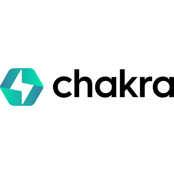
The Chakra UI icon is a rounded hexagon split into two halves by a zigzag lightning-bolt gap, each half filled with a teal gradient from deep teal (#3585A3) to mint (#00DEAE). The lockup adds “chakra” in a lowercase sans serif. This is the current logo from chakra-ui.com. It replaces the earlier teal circle with a lightning bolt.
The teal icon reads well on light and dark backgrounds. The black wordmark disappears on dark surfaces, so use the icon or the monochrome lockup there.
When to use this logo
Use Chakra UI in React component library comparisons, design system docs, frontend stack diagrams and starter template READMEs. It pairs naturally with React, Next.js, shadcn/ui, Tailwind and Storybook.